Home › Mobile-friendly design
📱 Included in the 99 USD package
Mobile friendly website on every screen
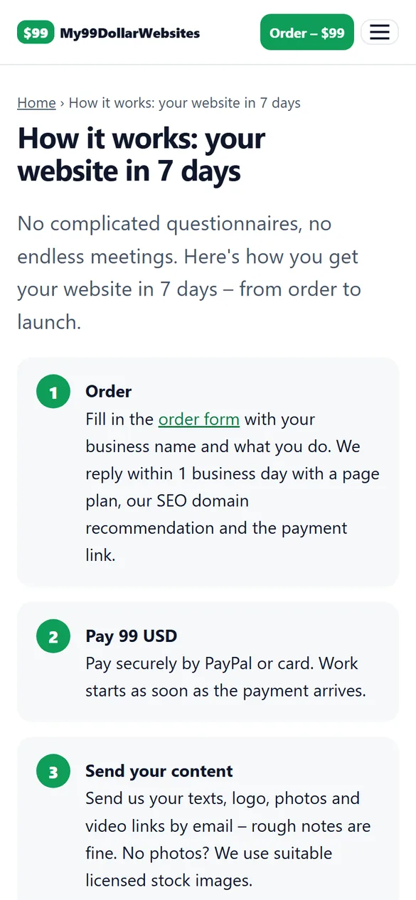
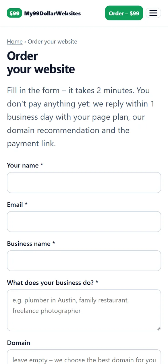
More than half of all visits come from phones. That's why we design your mobile friendly website for the small screen first – then make it look great on tablets and large monitors as well.
What you get
- Responsive layout that adapts to every screen size
- Large, readable text without zooming
- Buttons and links big enough to tap
- Click-to-call phone number and tap-to-email
- Mobile menu that's easy to use with one thumb
- Images compressed and sized for mobile data
Why mobile comes first
Google indexes the mobile version of your website first. If your site is hard to use on a phone, it is hard to find – and visitors leave within seconds. A mobile friendly website keeps them reading, calling and booking.
See it on a phone
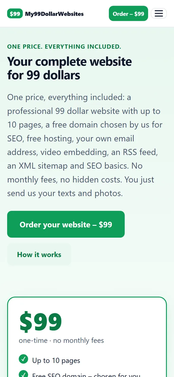
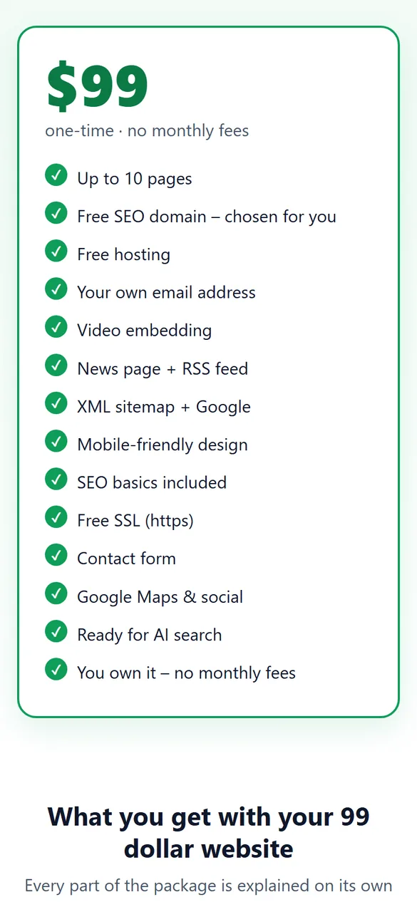
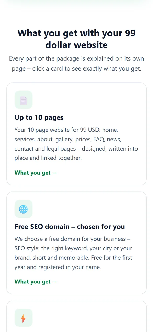
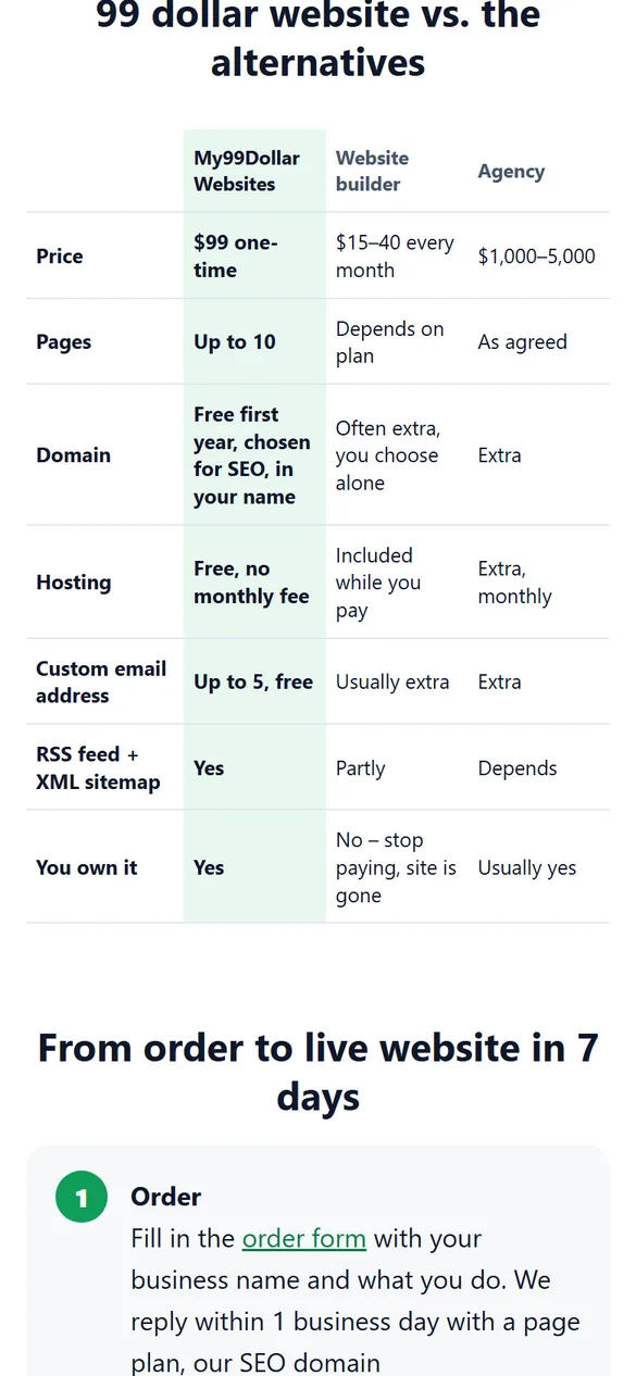
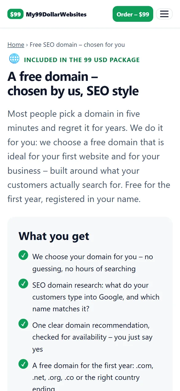
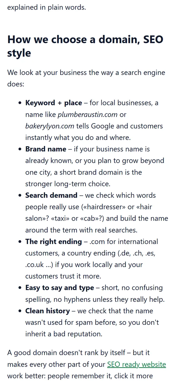
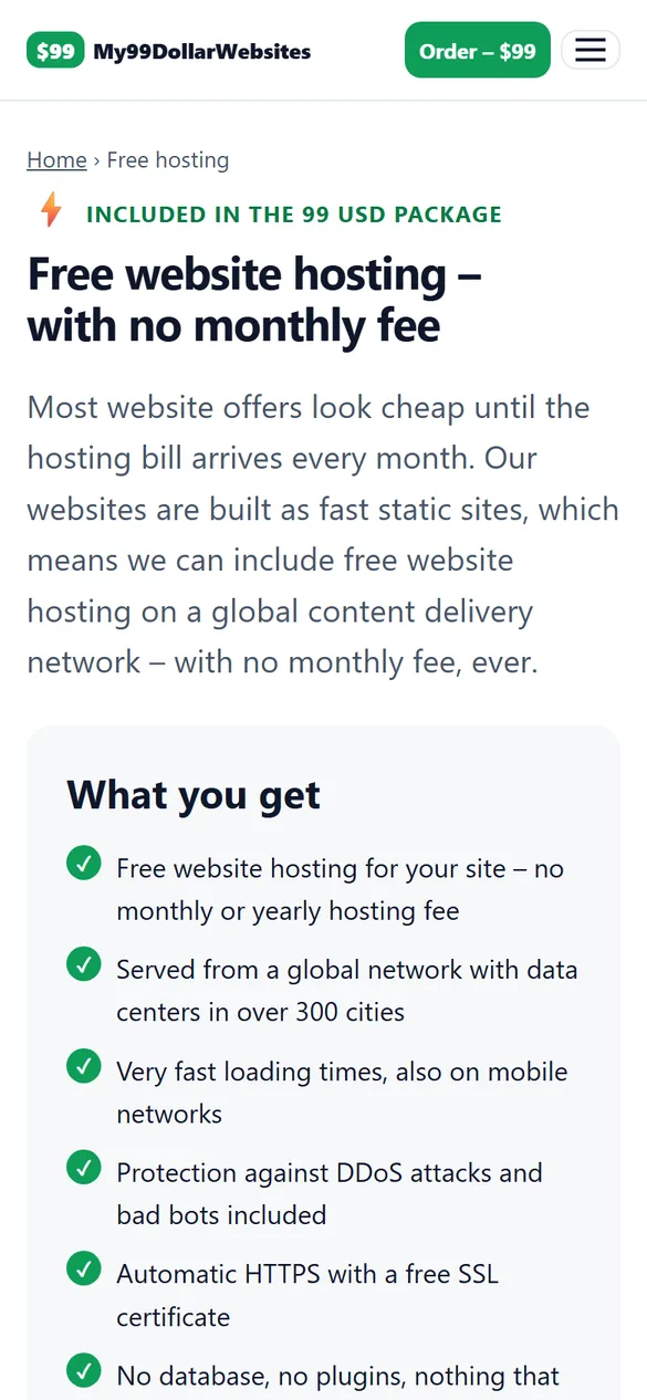
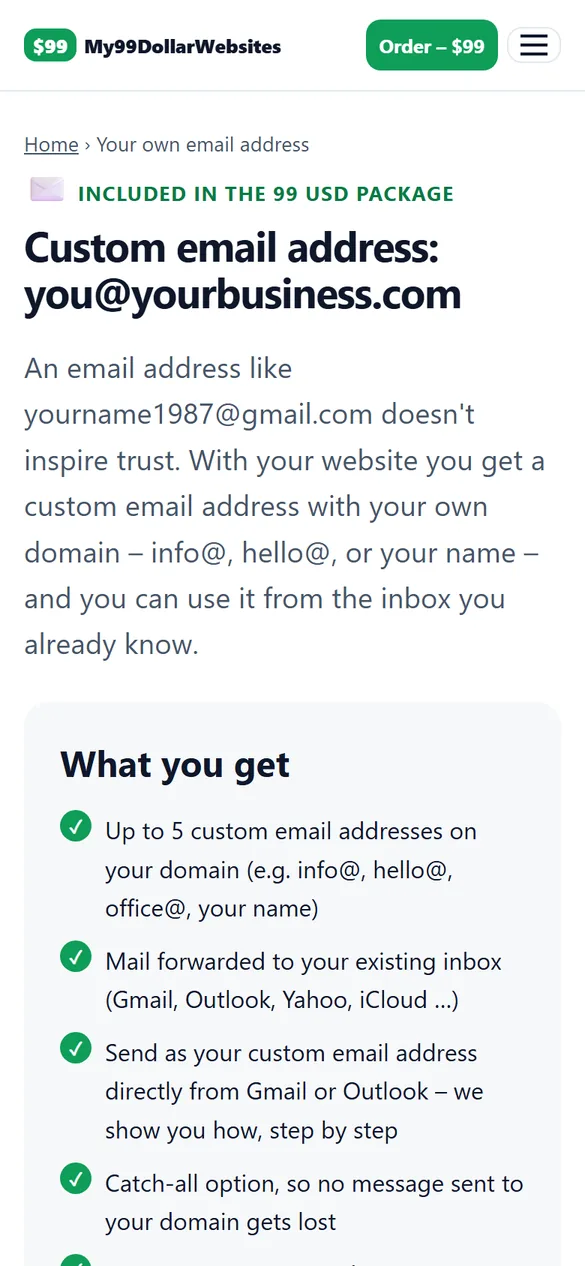
These screenshots show this very website on an iPhone-sized screen (390 × 844 points). Your mobile friendly website is built with exactly the same system – same readable text, same large buttons, same fast loading. Swipe through the gallery or tap a screenshot to open the real page.
Built for action
On a phone, people want to act: call you, find your address, send a message. Your phone number is a click-to-call link, your address opens in Google Maps, and your contact form is short and easy to fill out with a thumb.
Questions
Do you test on real phones?
Yes. We check every website on iPhone and Android screen sizes as well as tablets and desktops before launch.